Saturday, May 31, 2014

Insulate - #13: the round pallet

I hate round pallets. Among other reasons why, making sure that the sealer is applied evenly can be a bitch. This thrift store wooden picture circle is one of very few larger round pieces I'll ever do.

Here, two prints from the Spectrum art book series (vol. 8) are juxtaposed with a classic work by Banksy (taken from the book, You Are an Acceptable Level of Threat), on a black acrylic base.

Normally, I would apply 2-3 coats of paint but found that I liked the unfinished appearance of just 1 coat in this instance, and I played with the effects created with a small foam brush.

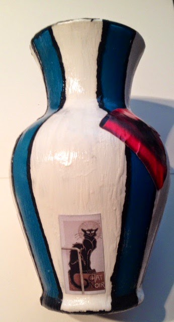
Getting this positioned and glued in place would have been next to impossible without first applying a light mist of spray adhesive before the final sealing.

The quote says, "LIVE THE DREAM - ENDURE THE NIGHTMARE"


Friday, May 30, 2014

Trifle - #12: the deadly bottles

7 deadly bottles to be precise...

This was a decorative little project with thrift store bottles using stock paper, black and white acrylic paint, phrases that came from a silly book about death, and green jute.

Bottle labels:

- Suicide -- San Francisco Style
- Brain-Eating Amoeba
- Killer Bees
- An Explosive Ending
- An Unfortunate Swelling
- Sleeping with the Fishes
- A Drunken Mess


Sangfroid - #11: the square ladies

Not too long ago, someone sent me a copy of Conceptions II by Luis Royo and, being an avid Royo fan, I knew some of those sketches would find their way into a piece.

I picked up a 4-pack of a drab and boring print at the thrift store primarily because they were done on a decent square of wood that was crying out for a blackwash, gray border and chevron patterned paper.


Thursday, May 29, 2014

Predicate - #9-10: the color-blocked purses

I decided with this thrift store purse that the modifications would only be with paint instead of adding any decoupage.  The color choices are my go-to shades and are peacock inspired.


Combining different types of items, all from thrift stores, turned this bland Guess purse into a more dramatic color-blocked statement piece. The Guess hardware was removed from the zipper and covered on the front by a vintage owl pendant that was previously on a necklace. The sides and bottom were painted with three layers of crimson red acrylic paint and the material on the back was cut from an Asian themed Chicos shirt.


Wednesday, May 28, 2014

Suffuse - #8: the frenchy vase

Transforming a very cheap vase from the back rack of a thrift store into a (obviously) French influenced composition was rather satisfying. I never use and don't think I even own any other vase. But they make great design pallets, especially for testing paper application skills along curves.

White acrylic stripes with black acrylic outlines and clip art from an artsy Paris guidebook.


Cultivate - #7: the rough necklace

Simple and quick modifications took this necklace in a direction I prefer.  Solid color acrylic paint dip and monosyllable found-word done with matte. Switched out the chain necklace for black cord.


Karyƫkai - #6: the triptych

To date, this has been my favorite in both production and result.

I knew I wanted to use something from my enormous sized book of French Impressionism I found at Title Wave some time ago. Settled on Monet's "La Japonaise" and I knew that the French classic of black and white stripes would make the red dress more vivid, but that it needed a little something more. As usual, the answer was "put a skull on it" which is my response to Portlandia's bird theory.


Adorn - #4-5: the beetle & monster earrings

My first foray into jewelry.  Which isn't necessarily the truth because I did at one time own an "easy bake jewelry oven" or whatever they were called.  And I'm pretty sure I remember my playdough barrettes and plastic rings being awesome...

The goal is to refurbish my shit.  I have a lot of crap jewelry that I never wear and my modification inspiration for the current crap pieces is to turn them into something that would theoretically catch my eye were I to see it hanging in a store, etc.  I want to make them into something I would buy, which usually translates to the presence of some counterculture influence. 

For the first pair, I pried off the embellishments and modpodged on a backing of a beetle pic and green origami paper. 


The second pair started with what I considered one of my ugliest pair of earrings and right away the beads had to go.  I then took apart 2 monster themed safety pin badge / buttons I had on hand from Mr O's Halloween costume last year and I think the black and white really made the background color pop.


Voyage - #3: the memorabilia

Hardly a day goes by when I don't think of last December and my 18 days away from home, wandering around Europe.  It was was one of those lifelong dreams and life changing experiences that leave a deep mark and are never forgotten.

Thrift store shelf with base of thick white cardboard and origami paper collage.


Eventide - #2: the nightstand

A really old black pressed wood nightstand that I have been dragging around for years.  It desperately needed to see either a face lift or the bottom of a garbage truck.  The result has made me glad I held onto it.

The prints all came from a book of large stock paper purchased at Michaels during the last Halloween season.  I always try to keep stuff like that on hand because you never know when you're going to need some skeletons or shadowy birds.